Ocho por Cuatro
health & branding
Naming - Branding - Art Direction - Packaging
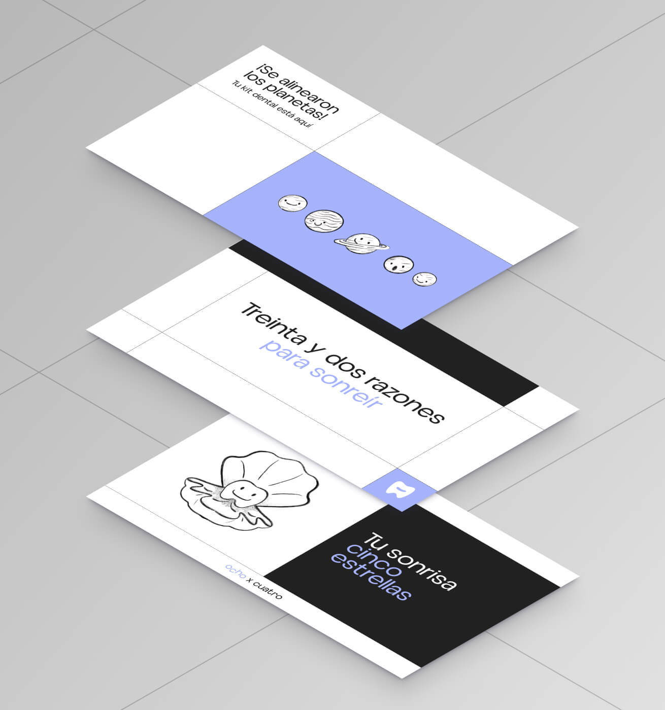
Ocho por Cuatro is a brand specializing in invisible dental aligners, offering a more comfortable alternative to conventional orthodontic treatments.
The brand name “Ocho por Cuatro” emerged from the naming process, cleverly incorporating wordplay referencing the number of teeth humans have.


> About the
inspiration
Their logo drew inspiration from alignment, successful processes, and optimal outcomes. The main composition presents a friendly symbol representing a dental piece in abstract form, along with typographic intervention that evokes the movement their users will experience in their pursuit of the perfect smile.
The primary palette of Ocho por Cuatro consists of three communicating colors. The light blue instills confidence, directly linking them to the healthcare industry, while the black adds expertise and sophistication to the brand. This palette seeks a subtle, modern, and reliable balance, achieving synergy between contrast, authenticity, and functionality.