Cocos y más
Food & Branding
Rebranding - Packaging
Cocos y más is a Colombian coconut processing company with over 30 years of history. The brand transforms locally sourced coconuts into a range of high-quality products for both industrial and retail markets.
After three decades of steady growth across different names and formats, the brand was ready for something new: an identity that could carry its heritage forward while opening doors to a broader, more competitive market.


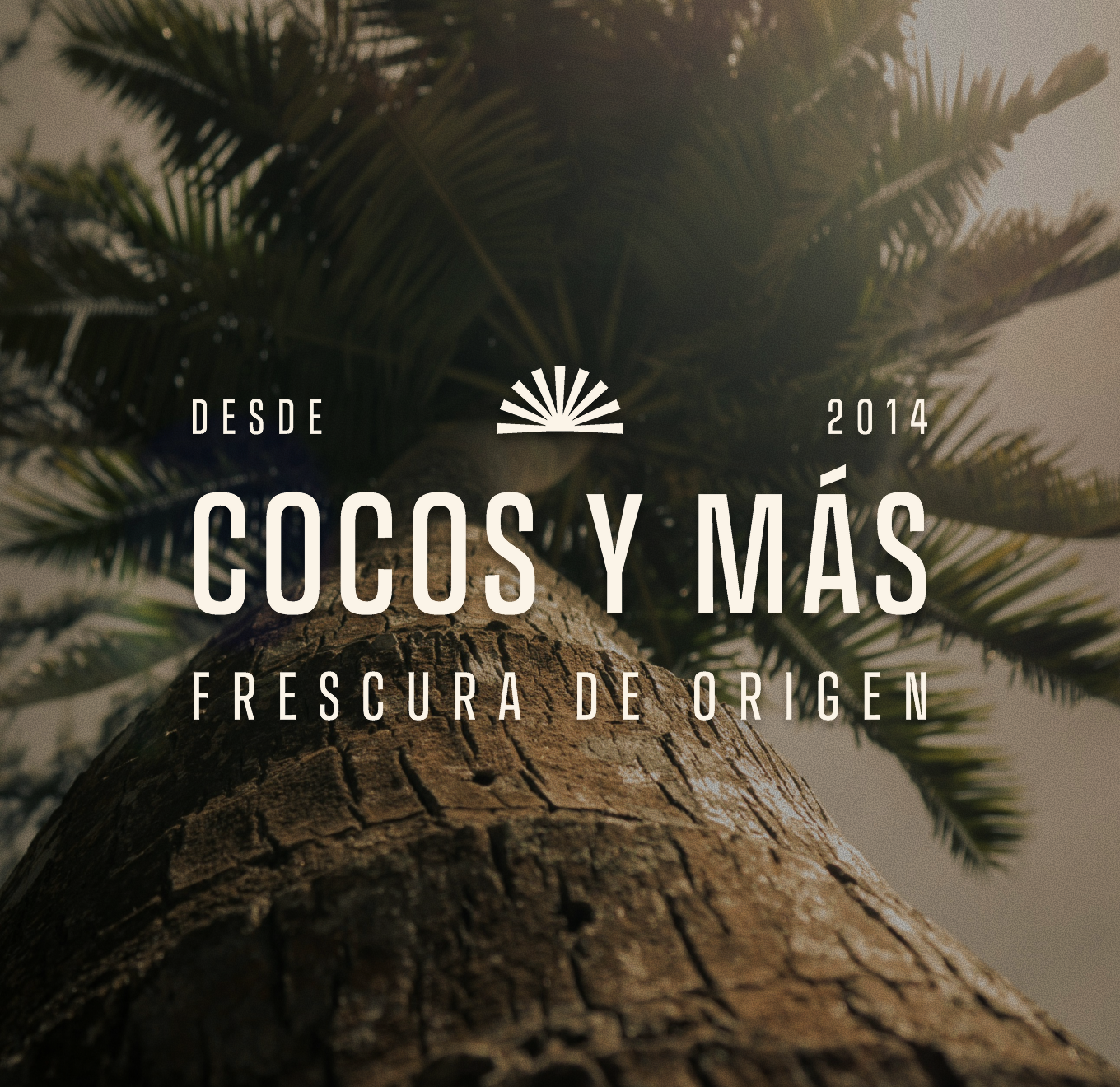
> About the
inspiration
The challenge was to translate 30 years of knowledge into a visual language that felt both fresh and grounded. We looked to the palm tree, the horizon, and the local landscape as the conceptual starting point. Elements that speak directly to the brand's origin and product.
From that foundation, we built a geometric, sophisticated logo system with multiple expressions that stay recognizable across every application. The color palette balances seriousness with warmth, giving the brand the confidence to compete at a national level while staying true to where it comes from.