Well-Crafted
wellness & branding
Branding
How would you tackle the challenge of creating a brand inspired by four unique women and their initiative to transform organizational well-being scientifically?
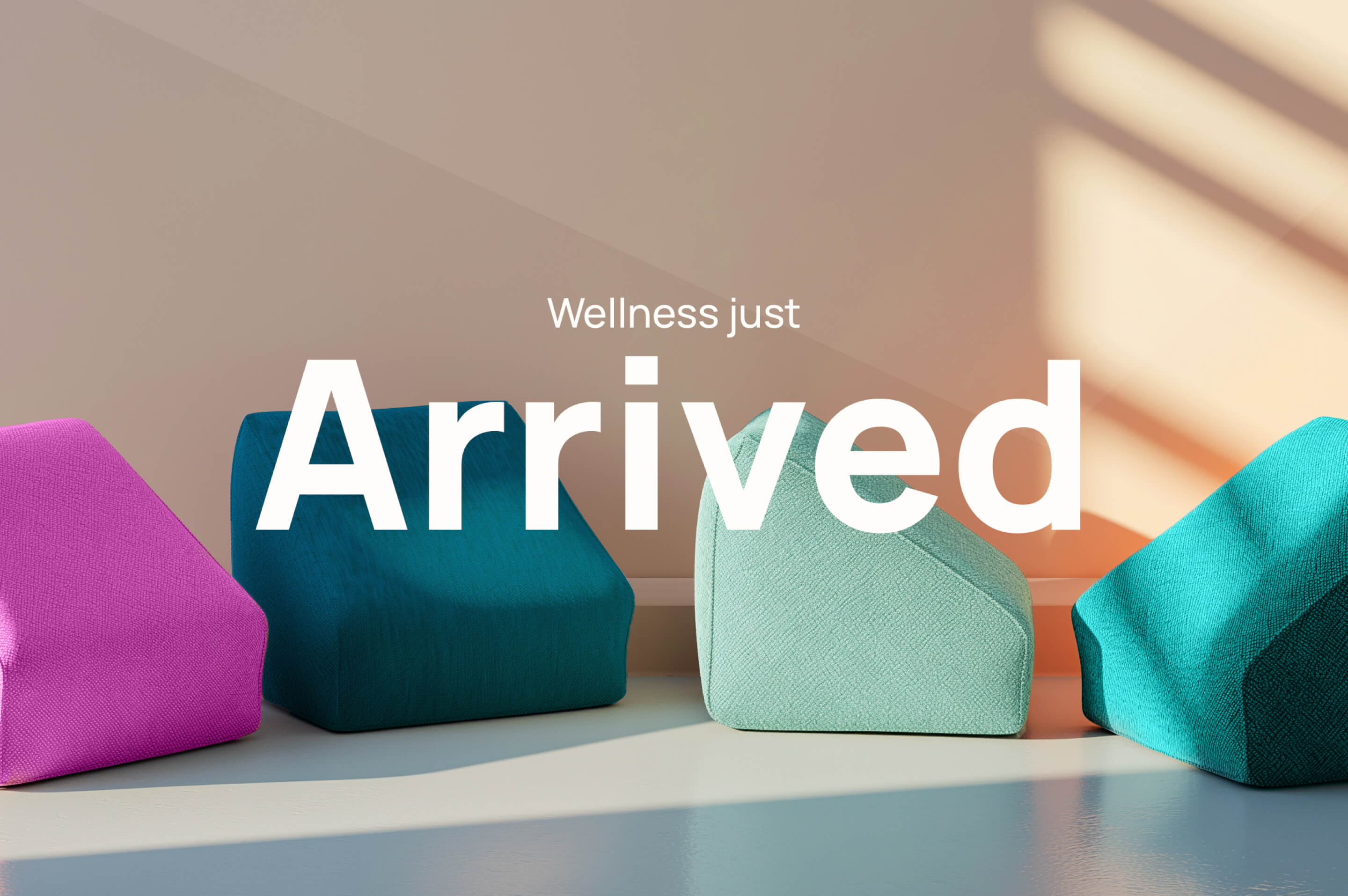
We decided to celebrate everything that made them and their company unique, turning this project into a universe of diversity, movement, empathy, color, and contrast.


> About the
inspiration
The main logo composition started with a blank canvas seen from different perspectives. Its various iterations remind us of the infinite solutions the Well-Crafted team can offer. One of the biggest challenges was achieving a professional yet creative tone for an industry where credibility primarily depended on traditional colors and structured fonts. However, with its fresh approach and understanding of the rules, this brand chooses to break them through asymmetrical geometric shapes for masks and blocks of color paired with modern and clean typography. The attention to detail highlights what they do best—adding fun to functionality.